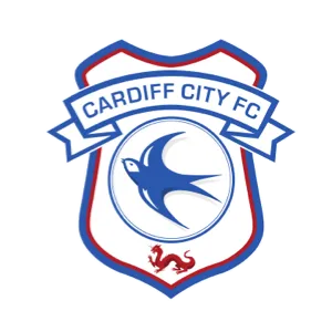
Cardiff City Football Club are proud to share the first visuals of the new Club crest, which will be used in full from the start of the 2015/16 season. The new crest will be displayed on our 2015/16 kits and across all Club communications and a number of new and exciting product ranges.
Outlined below are the reasons behind the planning and design process, with all decisions made with a view to producing a crest that all associated with the Cardiff City could identify with and embrace.
Our primary focus throughout the design and testing process was for the crest to demonstrate strong, historic links, while the modern and focused design is also seen as a strong visual step forward for Cardiff City.
We very much hope you enjoy the final results, which includes the return to prominence of the Bluebird, as linked to the welcome return to traditional colours in January 2015.
CLICK HERE TO VIEW THE CREST LAUNCH VIDEO
In recognition of the most successful achievement in Cardiff City Football Club history, our FA Cup winning squad proudly adopted a shielded Cardiff coat of arms on the shirts worn at Wembley Stadium in 1927. Led by Fred Keenor against Arsenal FC, the Bluebirds were victorious on St. George’s Day, 23 April thanks to Hughie Ferguson’s 74th minute goal.
On that day Cardiff City Football Club became the first team to take the FA Cup out of England, a feat that has never been repeated.
The shield shape has been used again on Cardiff City shirts in recent years, including our 1999 centenary and again between 2008 and 2012 following the change from the St. David’s cross.
Synonymous with Cardiff City FC, the Bluebird is key to our identity and has been our proud nickname for over one hundred years. Originally linked to critically acclaimed play ‘The Bluebird’ by Belgian playwright Maurice Maeterlinck in 1909, a successful New Theatre run led to supporters adopting the nickname in connection to our change from ‘Riverside FC brown and amber’ to ‘Cardiff City AFC blue’ in 1908.
The Bluebird has evolved on Cardiff City shirts since the introduction of the crest, though all have been based on a similar shape and design.
Most often carried inside a circle, as was the case in its original form, the latest Bluebird has proudly and carefully continued these important traditional themes, while taking the design to the current era in a streamlined, modern form.
Taking influence from the iconic typeface used in stadium signage at Ninian Park and again at Cardiff City Stadium, this is the first time the historic format has been carried within the crest itself. When planning the new design we found that the ‘Cardiff City FC’ wording was often difficult to see in previous crest versions, in particular on the shirt or when carried in a smaller format.
In order for the Club name to be clearly and proudly seen by all it was decided to introduce an expanded version of the banner across the shield, while returning to blue text on a white background, as had been the case in the original version of the crest. To keep the focus on the three main elements, including an increased sized Bluebird, additional slogans and banners were removed.
The 2015 dragon was created using three distinct influences, with a view to showcasing a design that was very much unique to Cardiff City.
Projecting our Welsh heritage, the stance was taken from the national flag, as has been seen on our crest or shirt for a number of years. Celebrating Asian linked culture, design and tradition influences, we also looked to create a dragon that could be primarily owned and appreciated locally.
To achieve this the main influence was drawn from the dragon placed on top of Cardiff City Hall, as has been the case since 1904. Designed by monumental and architectural sculptor Henry Charles Fehr, the dragon has been integral to the Welsh capital for over one hundred years.
Placed at the foot of the crest, the new Cardiff City dragon gives prominence to the Bluebird, as was outlined during the return of traditional Club colours in January 2015.
When researching football crest development, a recurring theme from a number of clubs was of simplifying previously busy and crowded designs to push the focus on key icons and typography.
It’s a trend we followed and by doing so we could concentrate on designing a clean and simple Bluebird led Cardiff City crest that was instantly recognisable, regardless of size.
A number of proposed new designs were tested to see how they would work in single colour formats and across a number of print or digital applications.
Test results made selecting the final approved version an easier task, with the new Cardiff City crest now ready to be carried across a number of new items in 2015 and beyond.
CLICK HERE TO VIEW THE CREST LAUNCH VIDEO